the new JasonMagbanua.com
the new JasonMagbanua.com
Personal
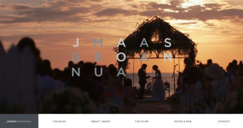
I am extremely proud and beyond happy to announce that my new website is now up and running – JasonMagbanua.com
But a backstory is in order –
Early on, while still securing footing in the wedding videography industry, I already realized that in order to differentiate myself and stand out, I had to deliver my content the best and easiest way possible to my audience. I mean, having beautiful and powerful videos was a given. But I had to make sure these films were watched and appreciated.
And ever since, I truly believed that a beautifully designed, easy to navigate, functional and constantly updated website was the most essential component in delivering my films and message.
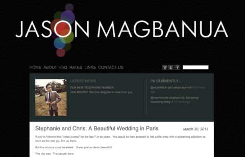
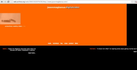
It was fifteen years ago when I had my first website made.
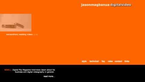
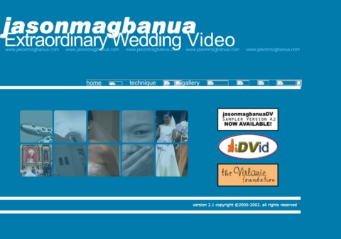
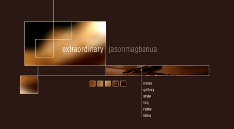
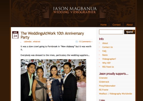
By 2002 I was already uploading our videos as WMV files (WMV!!!) so people could watch online. Those were teensy 8mb files I asked the viewers to download. By 2006, I put my heart on a sleeve by writing about my personal and professional through WordPress. There was also a brief and ugly tryst with Flash animation. Vimeo and Youtube made sharing my work on the world stage so much easier.
Social media changed everything the way you, my dear audience, connected with me. I guess, in a sense, I had to be where you were, whether Facebook or Instagram, but thankfully not Tindr. And what a party social media has turned out to be eh (especially in the last 10 months or so). You’ll still get the occasional political posts from me, the link to an obscure Spotify track, a good read from Fast Co. and memes, lots of memes!
Oh let’s not forget the sprinkling of Jason Magbanua selfies shilling anything from deodorant to mobile phones –
Oh, and if you don’t know yet – I am most unfiltered on Twitter.
So…what I wanted to say is – I’m big on web. I’m big on social media. I’m big on wedding video. And I’m big on connecting with you, my audience.
A big thank you for being there through the years!. Big shoutout the old ones who know what WMV is. And a big hello to all the youngsters who never knew what life was before the internet.

Now this iteration of the site just blows me away. The ass-kickery and the awesomeness is just so great my head hurts.
1. This site is mobile first and foremost. Everything is at the flicka da thumb.
2. Flawlessly responsive. Flawless!
3. Beautifully laid out page design. A truly immersive experience.
4. In-line loading of posts within Facebook. Get that Safari loading crap outta here!
5. In site playlists! Because all you want to do is binge!
6. You don’t want to go out the site, like Vegas casinos!
7. My head is hurting.
I could not ask for anything more from a web design team – take a bow Code and Theory!

And as a final note, if you’ve been watchful, you know we’ve been low key rolling out the new branding work by Inksurge.
The logo features a custom-type construction of the brand enclosed inside the rhombus with an equal ratio to present the perfect balance. This can also be translated into the different aspects of the finished product— the perfect light, the exact mood, the right emotion and the story itself.
So folks, enjoy the new website, the new content, the new look, the new branding – all these for you guys.
Thanks for sticking around!
